


Agronometrics in Charts: The American Blueberry Alliance dives into market data for ITC Post Brief


In this installment of the ‘Agronometrics In Charts’ series, Colin Fain illustrates how the U.S. market is evolving. Each week the series looks at a different horticultural commodity, focusing on a specific origin or topic visualizing the market factors that are driving change.


In response to our previous article, Agronometrics in Charts: Blueberry Coalition publishes analysis in response to ITC investigation, Travis Pope from Capital Trade, Inc. reached out and asked if we would be interested in writing a story based on the study done by them, on behalf of the American Blueberry Growers Alliance.
The Alliance is an organization that was formed in response to the USITC section 201 investigation which is in favor of U.S. import limitations on blueberries.
As stated in the previous article, Agronometrics is not taking a stance in the investigation. We have clients who stand on both sides of the issue and we look to support every subscriber with the same data and the same level of customer service.
This last statement is made all the more evident considering that Capital Trade, Inc. is also a customer of our service.
The Post-Hearing brief was also created to help the Alliance's lawyers argue their case before the USITC, so it clearly makes a partisan effort to demonstrate that imports have affected the competitiveness of U.S. producers.
Although I also don't necessarily agree with all the findings, there are interesting insights to be gained from the work that Capital Trade has done which I think is worthwhile bringing to light.
The chart that most stood out to me is below. Where the weekly market share in volume has been set beside the weekly share in the revenue.
What the report wanted to demonstrate is that the shoulders of production hold a larger economic role than the volumes in that time frame suggests.
I think the chart achieves its objective well, but more than that, this visualization offers a simple way to show where producers can get the best returns for their products.
This methodology is not only applicable to blueberries, including individual origins as made available by the USDA, but it can easily be replicated in different commodities as well.
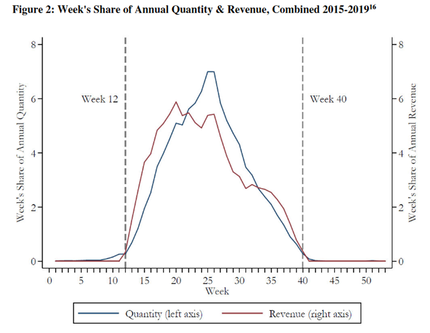
Sources: U.S. and Import Volume are from Agronometrics based on weekly Movement reports from the USDA Agricultural Marketing Service (AMS). US and Import Prices are from Agronometrics based on weekly Shipping Point reports from AMS, weighted by Movement volume. All prices in dollars per pound.
The calculation is easy enough to do. At the end of the season, all you have to do is divide the volumes of any given week by the total volume from the origin that is being studied.
The revenues are only slightly more complex to calculate as they require multiplying prices by the volumes that arrived in any given week to calculate an estimate of weekly revenue. To calculate the share of that week's revenue, the value just needs to be divided against the total revenue for the season that is being observed.
To calculate the effects from 2015-2019 the weekly volumes for each week over the years observed can be added, dividing the sums against the total volume of all years together. The same calculation can be done for revenue.
As Capital Trade notes in Attachment D, the revenue figures are “intended to be a proxy for actual revenue earned by growers but overstate the level of revenues. The Shipping Point data, as its name suggests, does not reflect the same level of trade as farmers’ financial operations. However, the trend in this revenue measure is representative of the trend in growers’ actual revenues.”
I have no idea what will happen to the investigation and whether or not trade restrictions will be imposed. The process, however, has brought a new level of scrutiny over the industry's commercial data, that can offer value for those who look for it.
The full version of Capital Trade’s report is made available on the ITC’s EDIS website by creating an account. However, we are making a version of the document that was shared with us available here for your reference. The chart I used above can be found on Page 34.
In our ‘In Charts’ series, we work to tell some of the stories that are moving the industry. Feel free to take a look at the other articles by clicking here.
You can keep track of the markets daily through Agronometrics, a data visualization tool built to help the industry make sense of the huge amounts of data that professionals need to access to make informed decisions. If you found the information and the charts from this article useful, feel free to visit us at www.agronometrics.com where you can easily access these same graphs, or explore the other 20 fruits we currently track.


Subscribe to our newsletter